Own project

From ugly admin screens to a complete new design

A multi-brand membership and rewards back office for a retail and food group. About 100 pages, moved off a stock admin template and onto a design system of its own.
Design
YK: every screen and the design system
Scope
About 100 pages, 10 brands, light and dark, phone to desktop, 4 languages
Time
About 3 weeks. The plan said about 8 months.
Note
Names, brands and data are made up. The screens were rebuilt for this page.
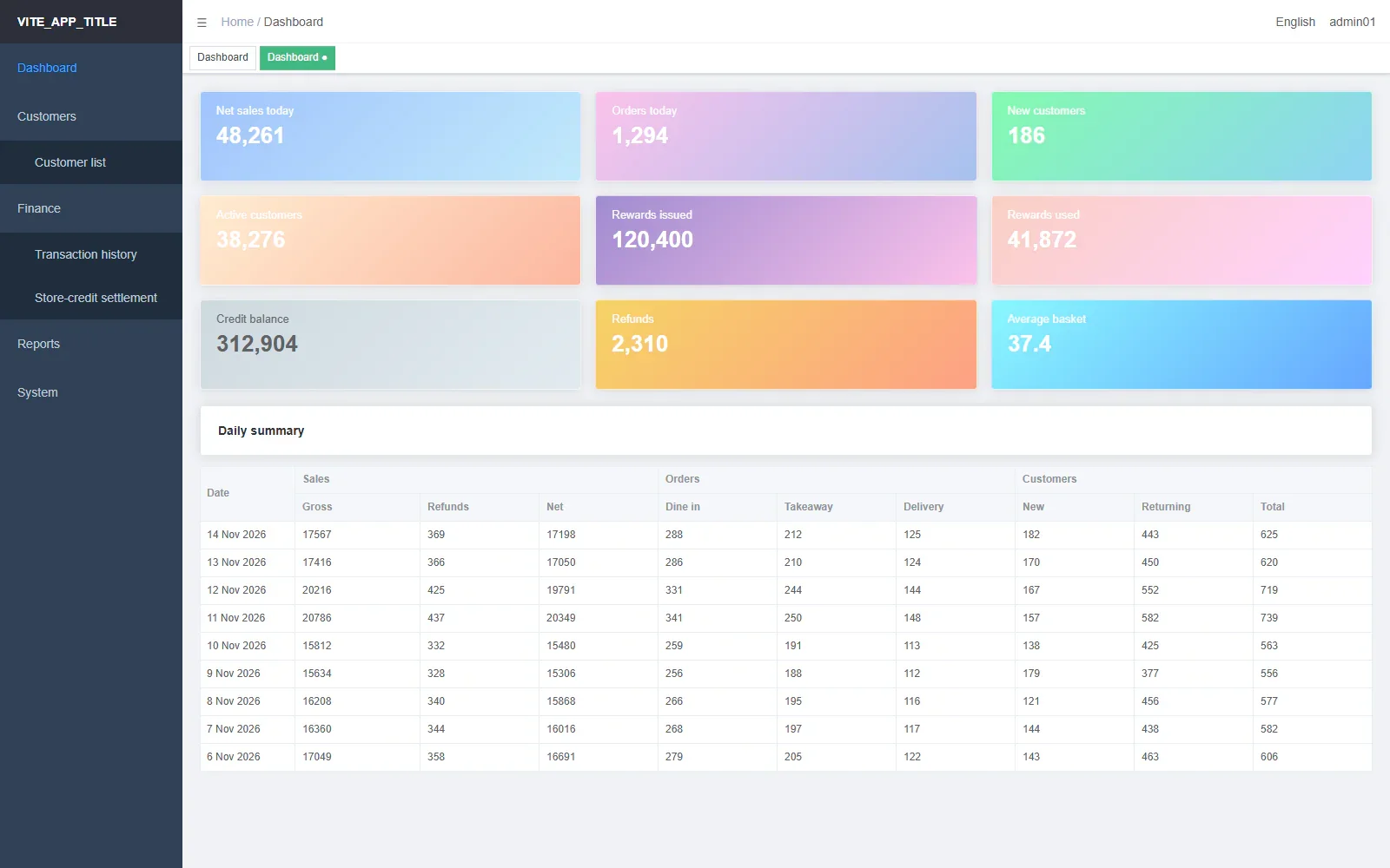
The old dashboard: nine pastel gradient cards above a wide summary table Before
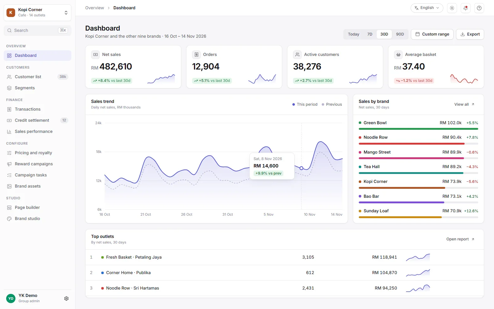
The new dashboard: key figures with small charts, a sales trend and sales by brand After

The old dashboard and the new one, on the same made-up data. The new design also has a dark mode.

Where it started

The first version ran on an open-source admin template. It shipped fast. Then it grew to about 100 pages, each styled by hand.

No shared parts

Every page was styled on its own. Two pages never looked like one product.

State shown as paint

Status filled whole table cells gold, lime or red. Amounts showed as raw numbers.

Dialogs as pages

Editors opened in huge dialogs. Writing one task chained up to three of them.

One look for ten brands

Dark mode had no switch. Every brand got the same default blue.

How the new design was built

Bottom up, so a page is assembled, not styled. Every value on a page comes from the layer below it.

  1. Tokens

    Colour, type, spacing, radius and motion, in light and dark. One palette for each brand.

  2. Components

    Buttons, pills, tables, fields, dialogs and drawers. One registry and one naming rule.

  3. Page shells

    The app frame, the list page, the detail page, the config canvas and the stepper.

  4. Screens

    Each screen is assembled from the shells, then checked in light and dark.

Before and after

Ten screens, with the same made-up data on both sides. Drag the line, or focus a picture and use the arrow keys.

Dashboard

Sales across every brand, at a glance.
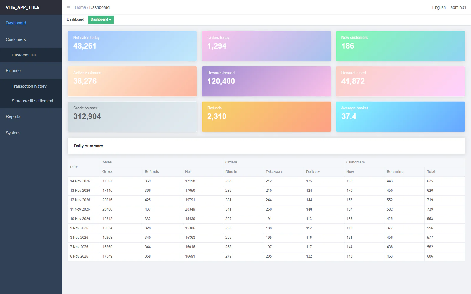
Old dashboard: nine pastel gradient cards above a wide summary table
New dashboard: four key figures, a sales trend chart, sales by brand and a top outlets table
Before After
Dashboard: drag to compare the old and the new screen.

Before

  • Nine pastel cards, each with its own gradient.
  • No chart. The trend lived in a table with three header groups.

After

  • Key figures on one card style, each with a small chart and a change badge.
  • A sales trend against the last period, with sales by brand beside it.

Customer list

Find, filter and act on members.

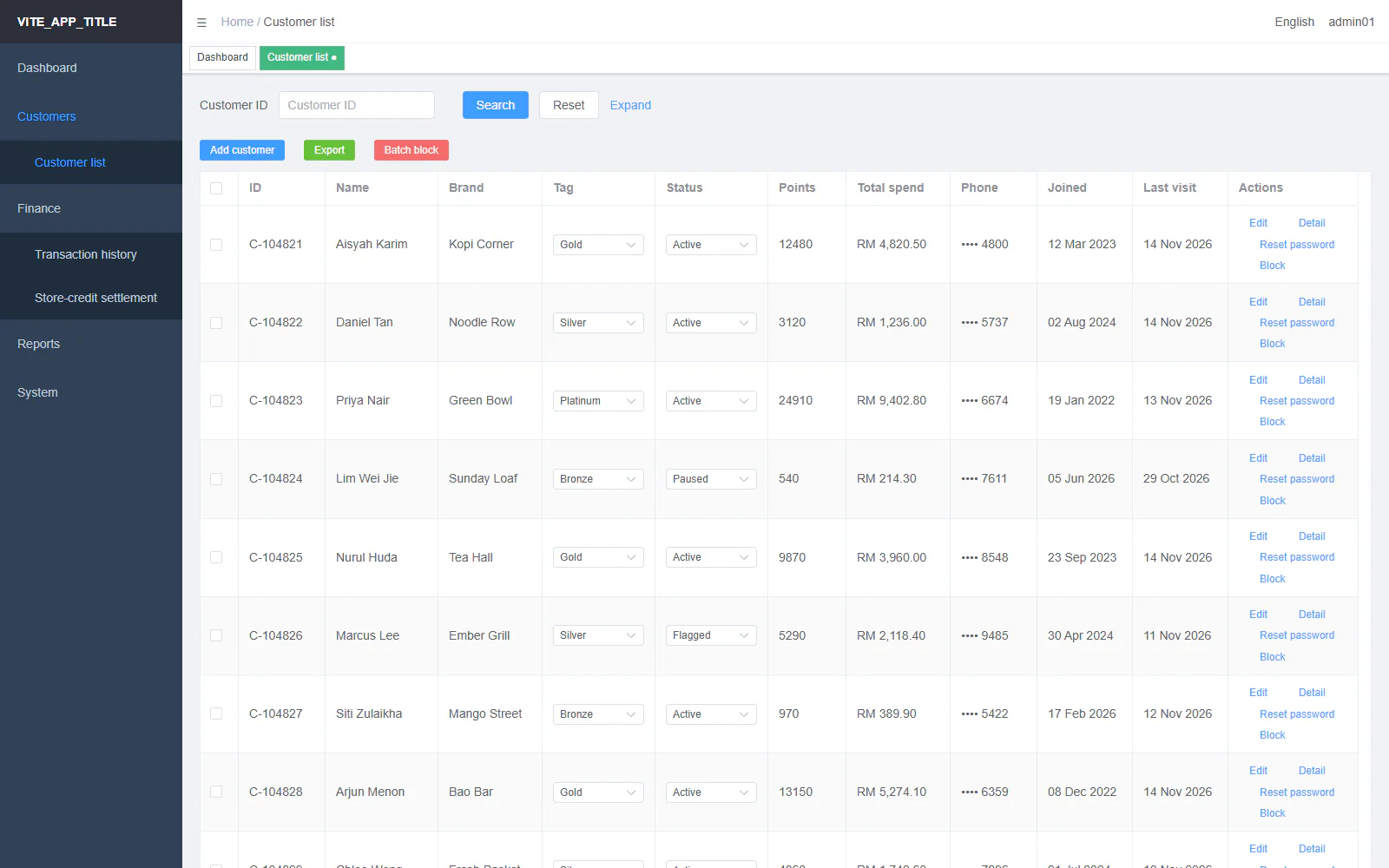
Old customer list: a tall table with dropdowns and four text links in every row
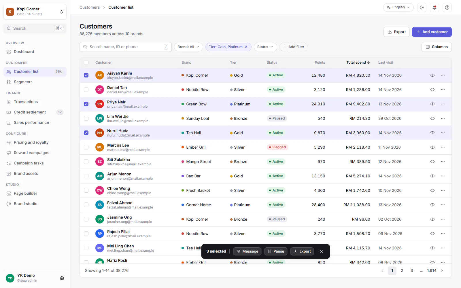
New customer list: search, filter chips, status pills, ticked rows and a floating selection bar
Before After
Customer list: drag to compare the old and the new screen.

Before

  • Every row carried two live dropdowns and four text buttons that wrapped onto two lines.
  • Most filters hid behind Expand, and nothing said which were set.

After

  • One search box, with filters as chips you can see and remove.
  • Tier and status as quiet marks, and row actions as icons.
  • Ticking rows opens a bar with the bulk actions.

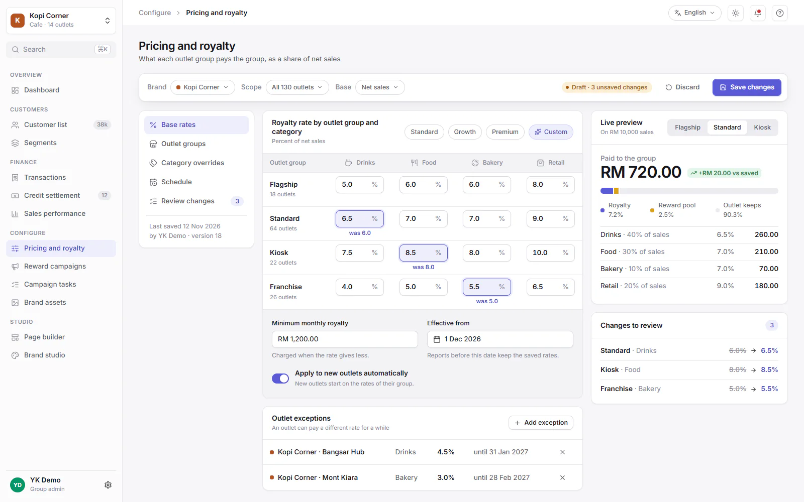
Pricing and royalty rates

Set what each outlet group pays the group.
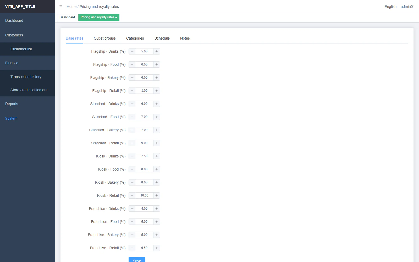
Old rates page: tabs above one long form of number boxes
New rates page: a context bar, a rate grid with marked changes, a live preview and a review list
Before After
Pricing and royalty rates: drag to compare the old and the new screen.

Before

  • Five tabs, each a long form. Settings were edited one tab at a time.
  • Nothing showed what a change would do before saving.

After

  • A config canvas: a context bar with a draft state, Discard and Save.
  • A rate grid by outlet group and category, with changed cells marked.
  • A live preview on a sample sale, and a list of changes to review.

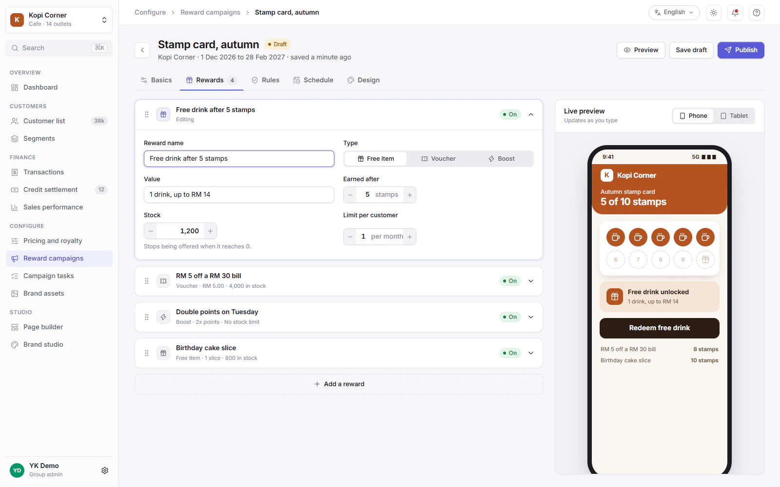
Reward campaign editor

Build a stamp card and see it as the customer will.
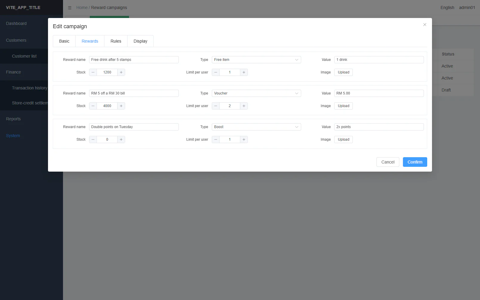
Old reward editor: a large dialog with a stack of small forms
New reward editor: reward cards on the left and a live phone preview of the stamp card on the right
Before After
Reward campaign editor: drag to compare the old and the new screen.

Before

  • A huge dialog with card tabs and a small left-labelled form for each reward.
  • No way to see the reward card while editing it.

After

  • Tabs with icons, and rewards as cards you can open.
  • A live phone preview updates as you type.

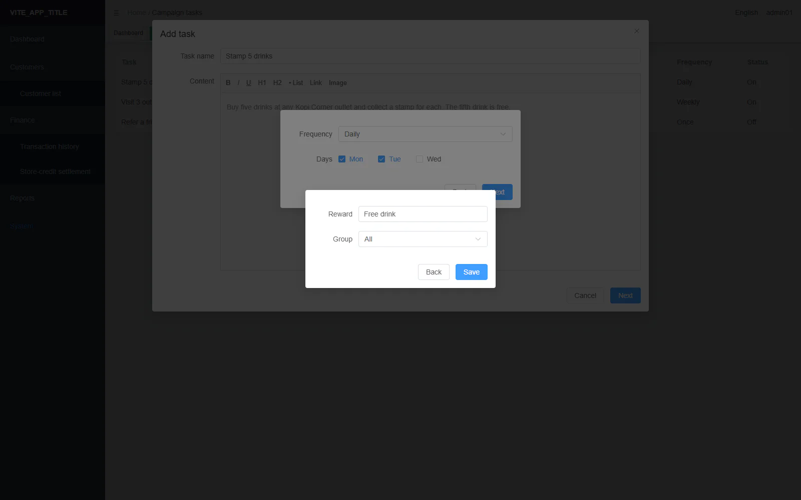
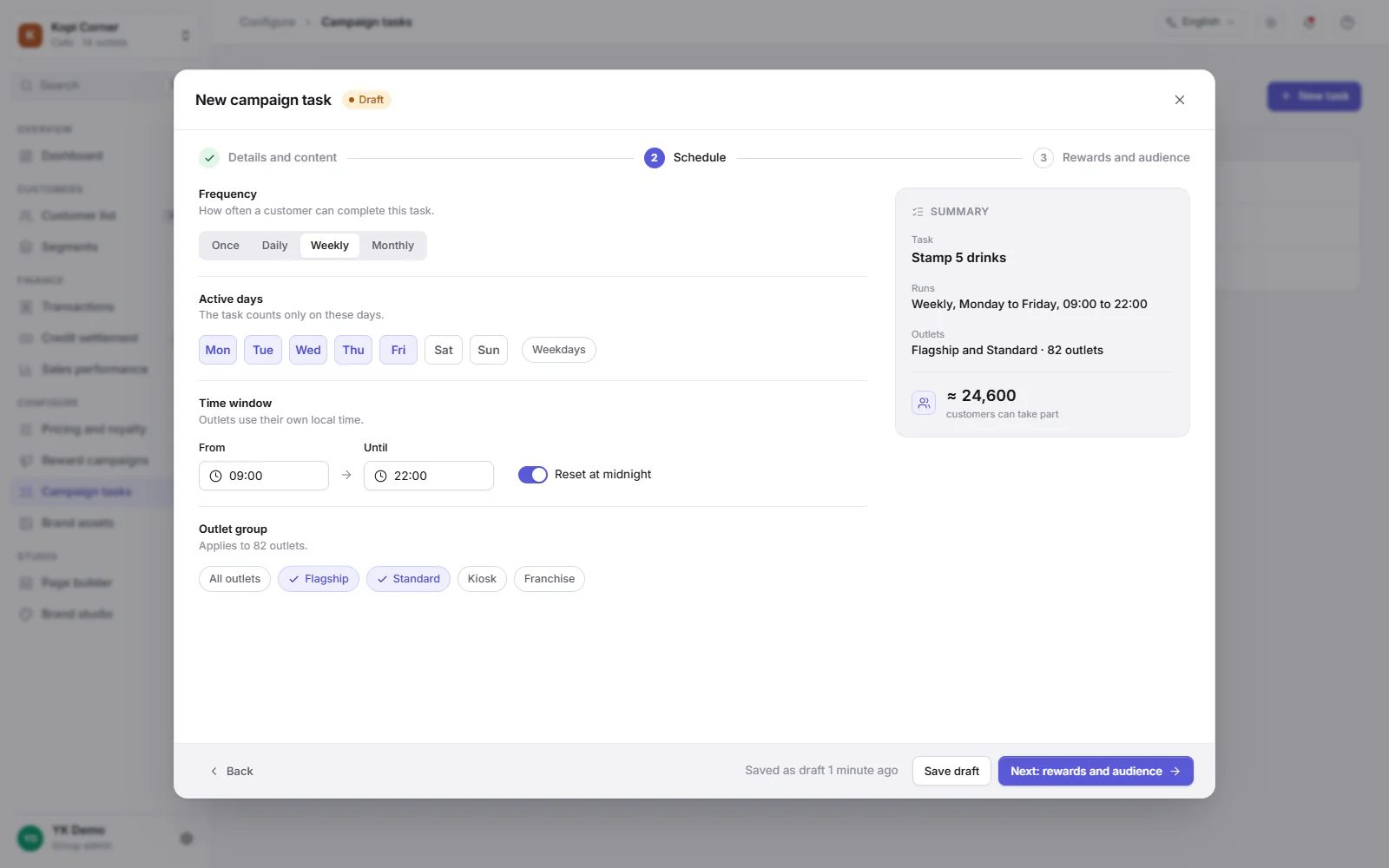
Campaign tasks

Write a task in three steps.

Old task editor: three dialogs stacked on top of each other
New task editor: one dialog with a stepper, titled sections and a summary panel
Before After
Campaign tasks: drag to compare the old and the new screen.

Before

  • Writing a task opened up to three dialogs in a chain, two of them with no title.
  • A big text editor took most of the first dialog.

After

  • One dialog with a three-step stepper: details, schedule, rewards and audience.
  • Each step is split into titled sections, with a live summary beside it.

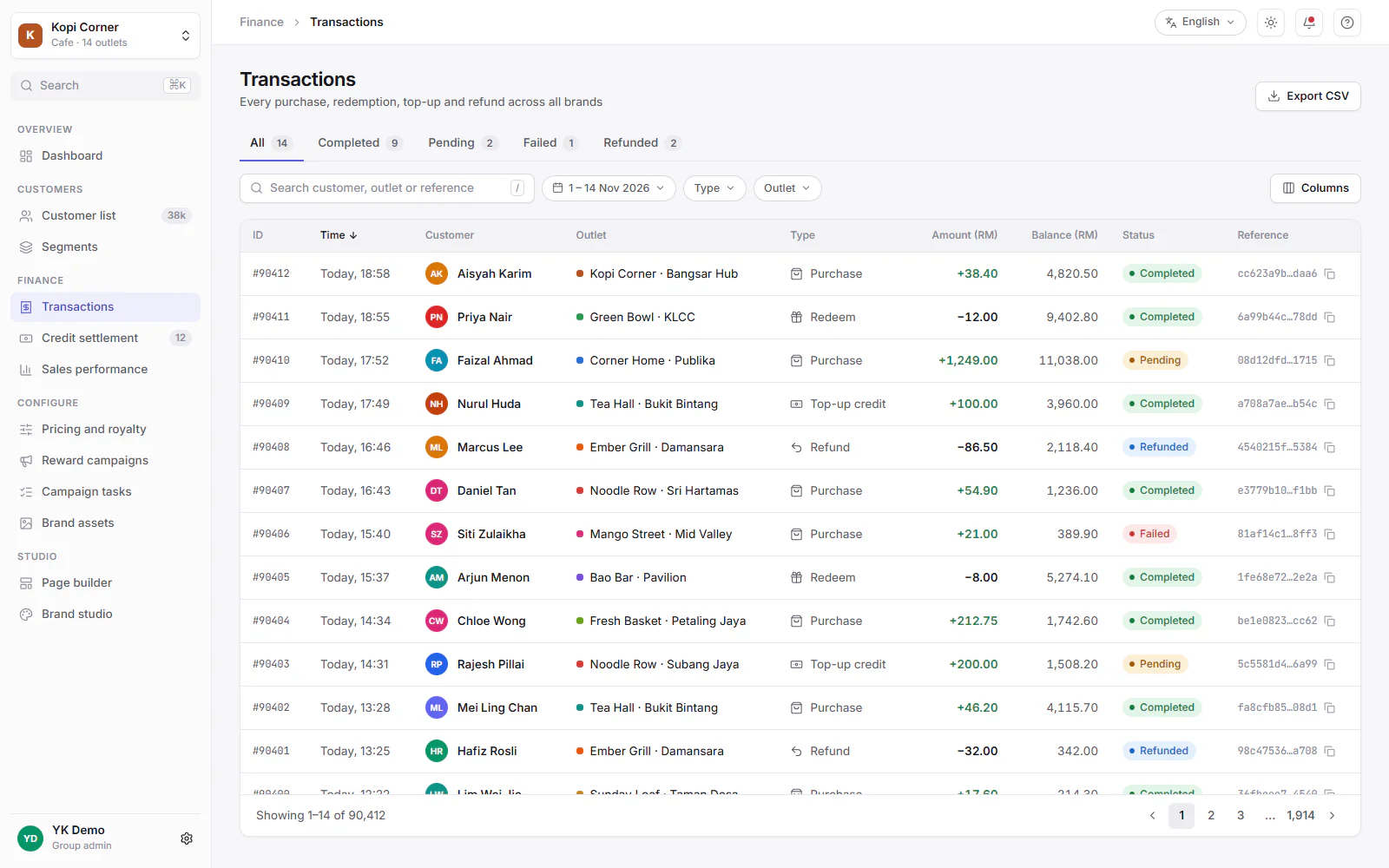
Transactions

Every purchase, redemption, top-up and refund.
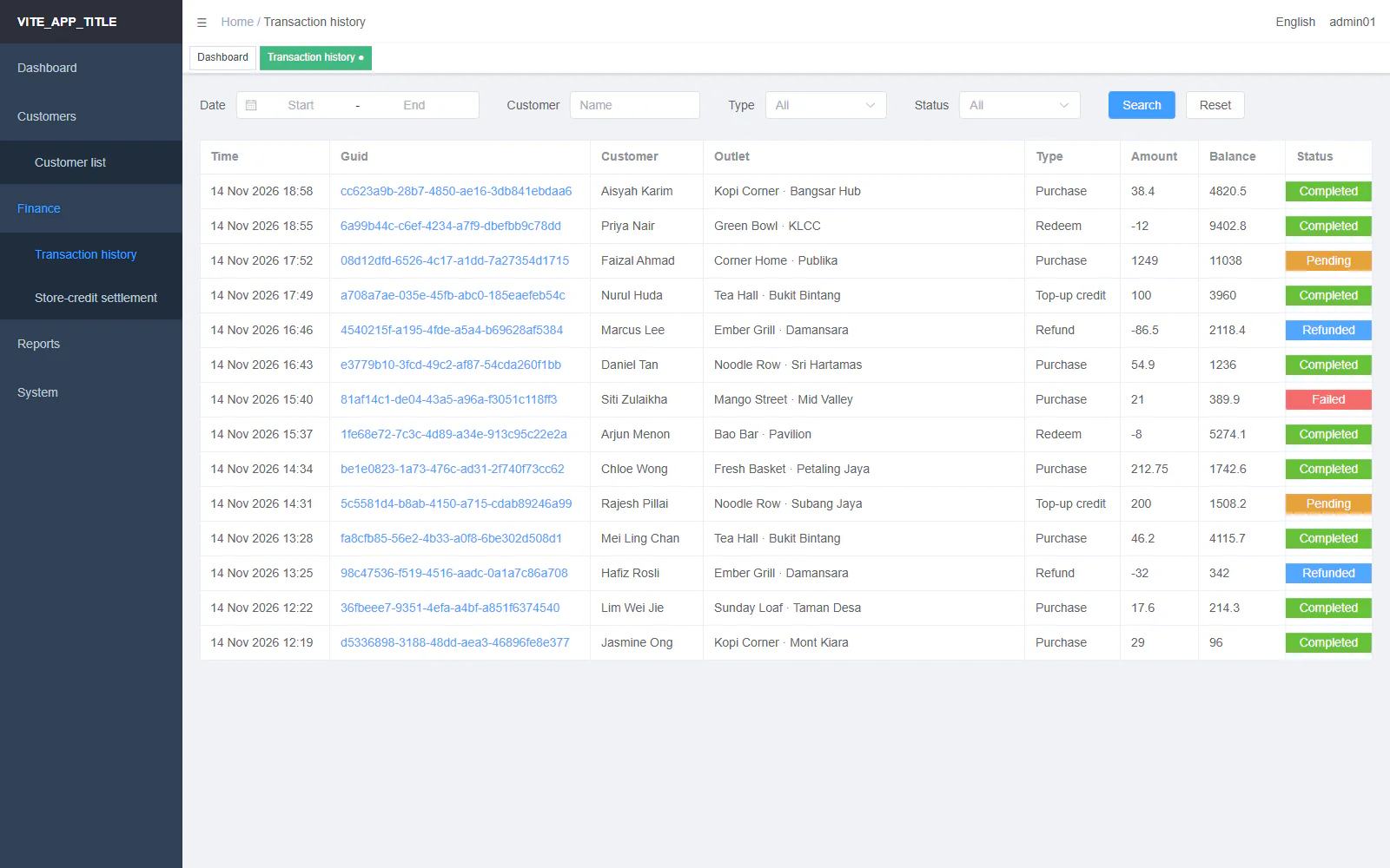
Old transaction list: whole table cells painted in bright colours by status
New transaction list: status tabs, filter chips, signed amounts and status pills
Before After
Transactions: drag to compare the old and the new screen.

Before

  • Status painted whole cells gold, blue, lime or red.
  • Amounts were raw numbers, the reference was a plain link, and nothing sorted.

After

  • Status as pills on one shared scale. Amounts with a sign and two decimals.
  • Tabs with counts, a sortable time column and filters in one row.

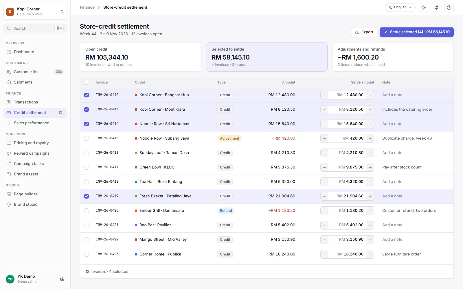
Store-credit settlement

Pay outlets what they are owed, in one pass.
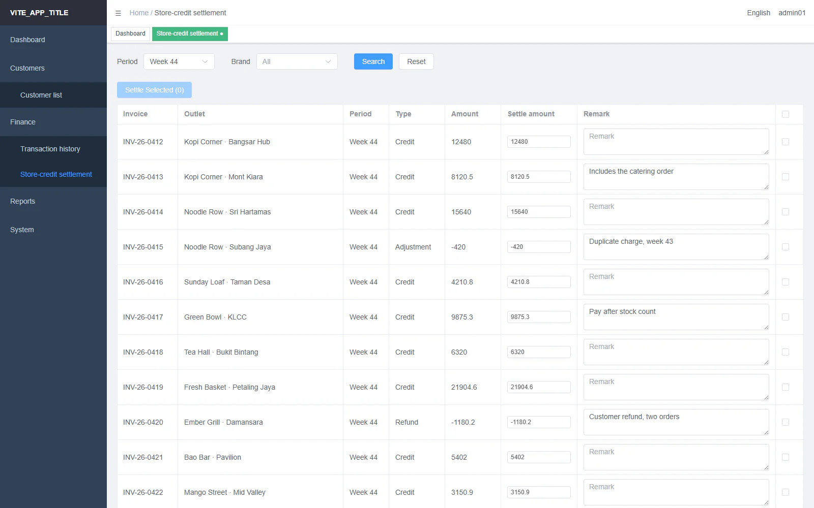
Old settlement page: a disabled button above a table with tall note boxes
New settlement page: three summary cards, a primary action with the total and highlighted rows
Before After
Store-credit settlement: drag to compare the old and the new screen.

Before

  • The main action sat disabled above the table until a row was ticked.
  • Note boxes stretched the rows tall, and the select-all box sat at the far right.

After

  • Settle selected moves to the page header and shows the total.
  • Amounts sit right-aligned in steppers, and ticked rows are highlighted.

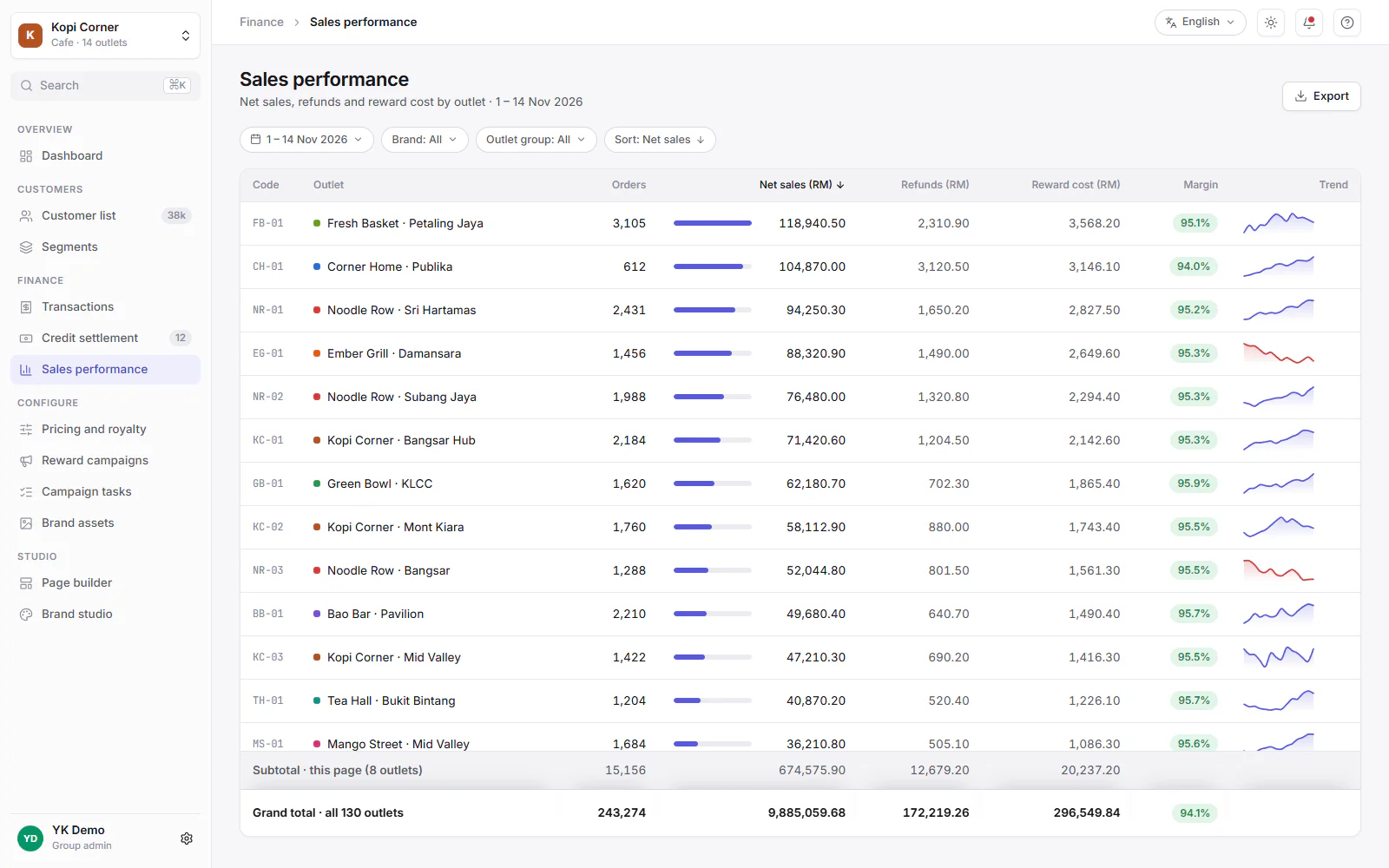
Sales performance

Compare outlets on sales, refunds and reward cost.
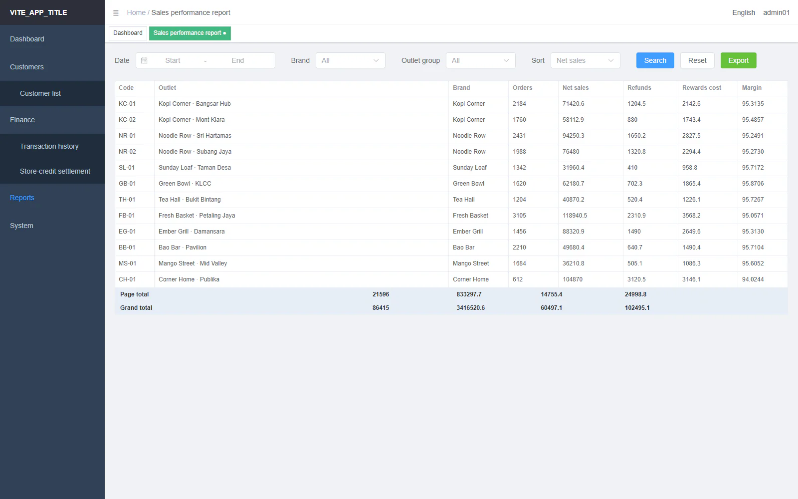
Old sales report: a block of filters above a plain table with two total rows
New sales report: filter chips, bars and trend lines in the rows, a subtotal and a pinned grand total
Before After
Sales performance: drag to compare the old and the new screen.

Before

  • No page title. Filters filled the top half of the screen.
  • Two grey-blue total rows sat at the foot of the table.

After

  • A page header with Export, and the filters on one line.
  • A page subtotal, then a grand total that stays in view.

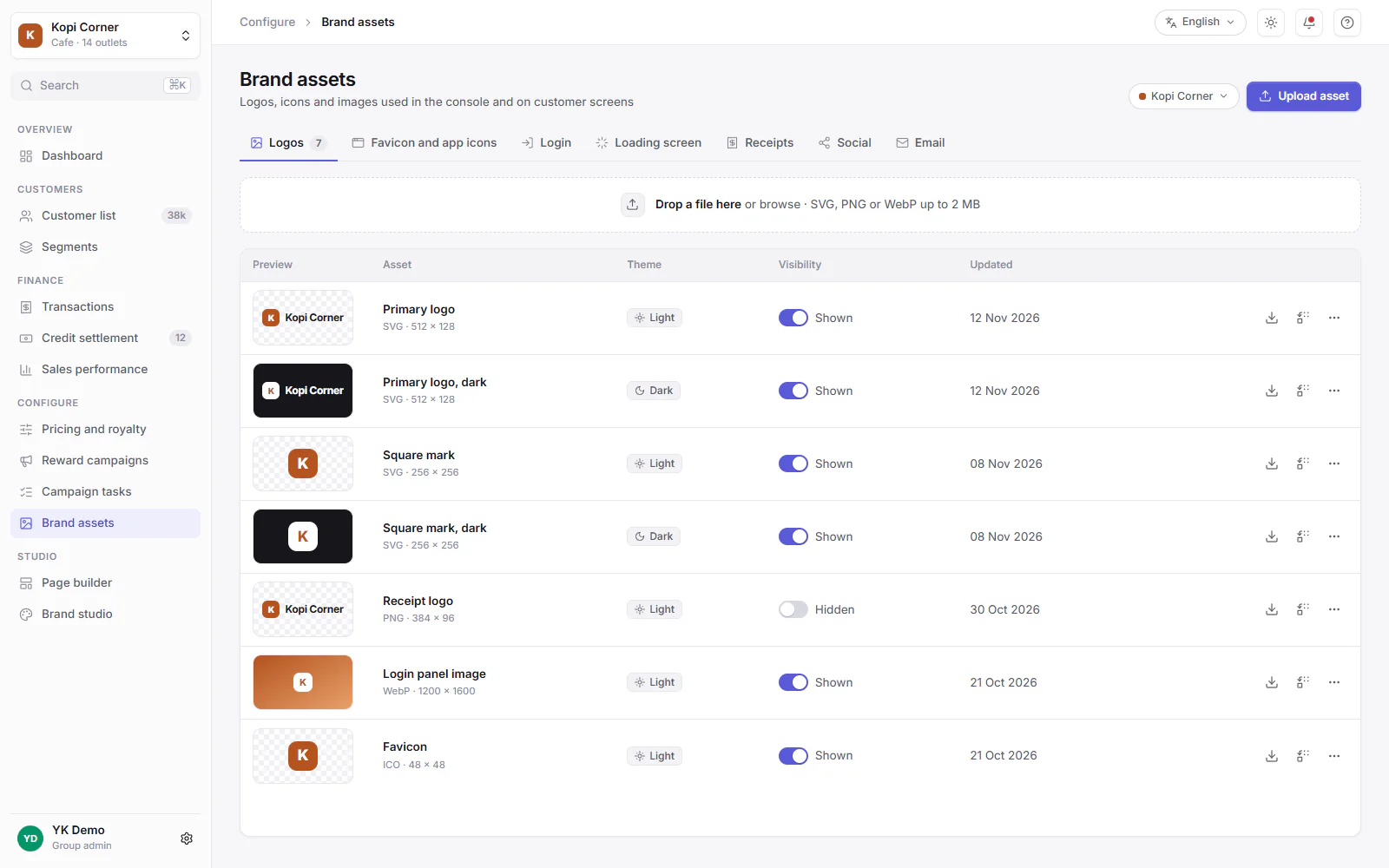
Brand assets

Manage logos and images for each brand.
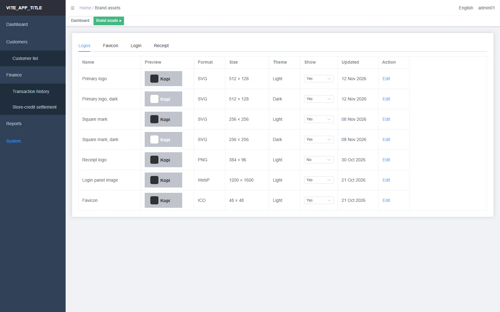
Old brand assets page: a table of logos on grey boxes with a dropdown in each row
New brand assets page: icon tabs, a drop zone and logo thumbnails on light and dark plates
Before After
Brand assets: drag to compare the old and the new screen.

Before

  • Four tabs, a dropdown in every row for Show, and a plain text Edit button.
  • Every thumbnail sat on the same grey box.

After

  • Seven tabs with icons, and a drop zone for new files.
  • Thumbnails sit on a matching light or dark plate. Show is a switch, and actions are icons.

Sign in

The first thing every person sees.

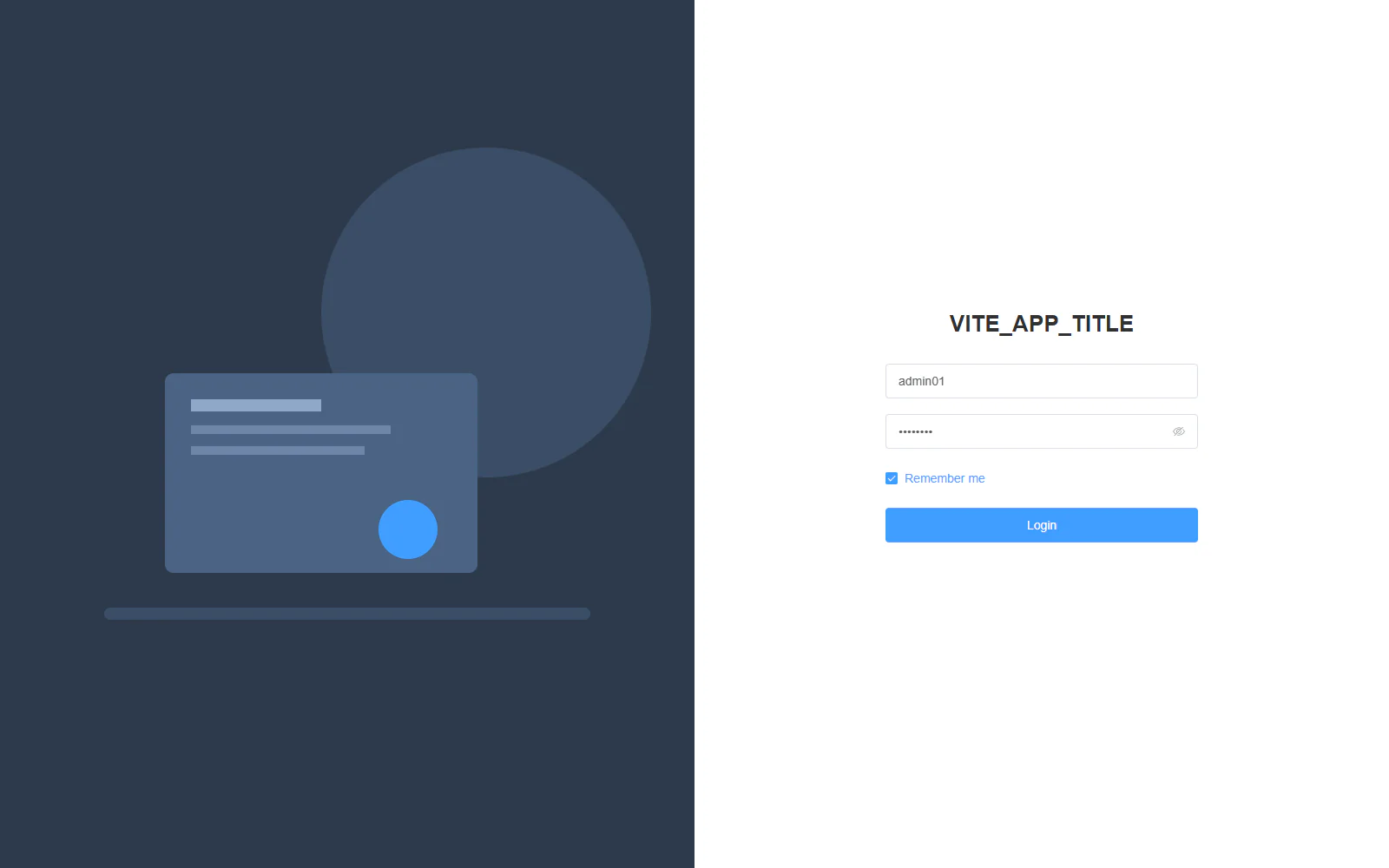
Old sign-in page: a flat navy half with a simple picture beside a plain form
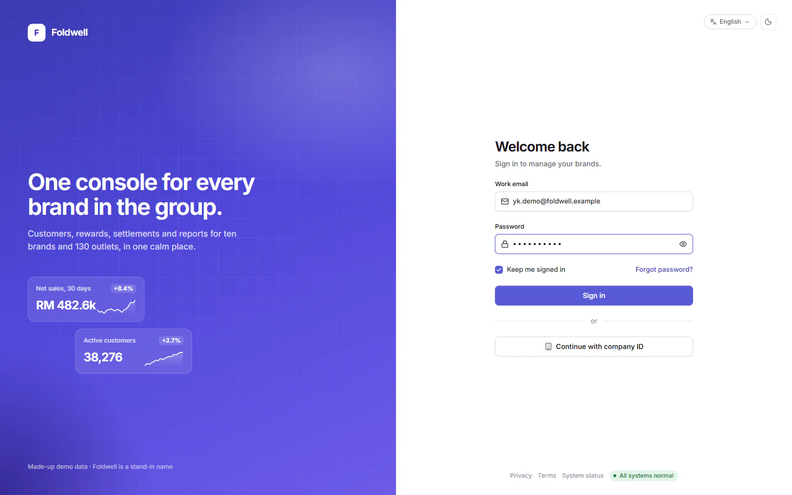
New sign-in page: a brand panel with a headline and two small figures beside a clean form
Before After
Sign in: drag to compare the old and the new screen.

Before

  • A split screen: a flat navy half with a stock picture, and a form floating on white.
  • The product name showed as a raw build variable.

After

  • A brand panel with the logo, a promise and two live figures.
  • A calm form, with the theme and language switches in reach.

New with the redesign

Two screens had no old version. The new system made them cheap to build.
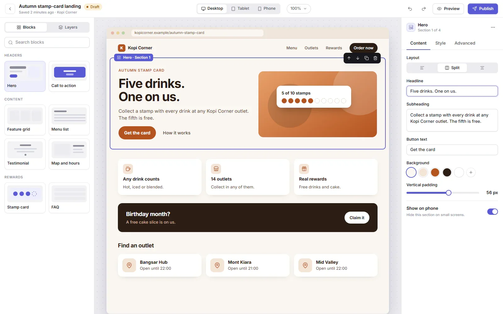
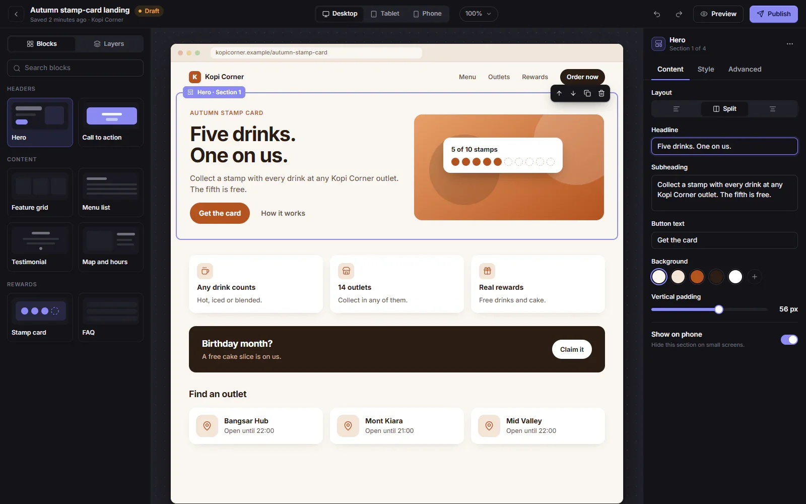
Page builder in light mode: a block library, a page canvas with a selected section and a settings panel Page builder in dark mode: the same block library, canvas and settings panel

Page builder

Marketing pages from a block library, edited on a canvas with section settings and a phone preview.
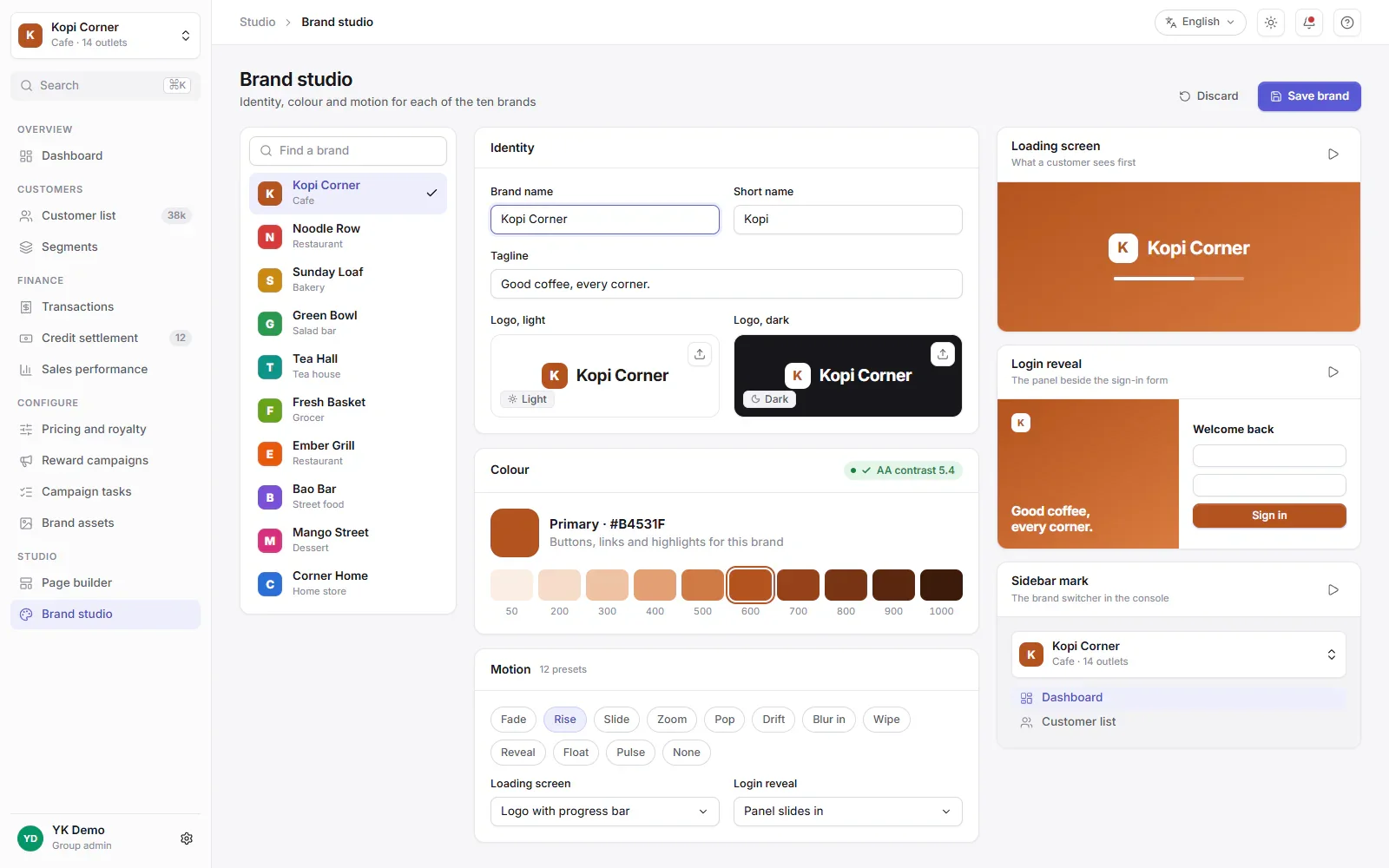
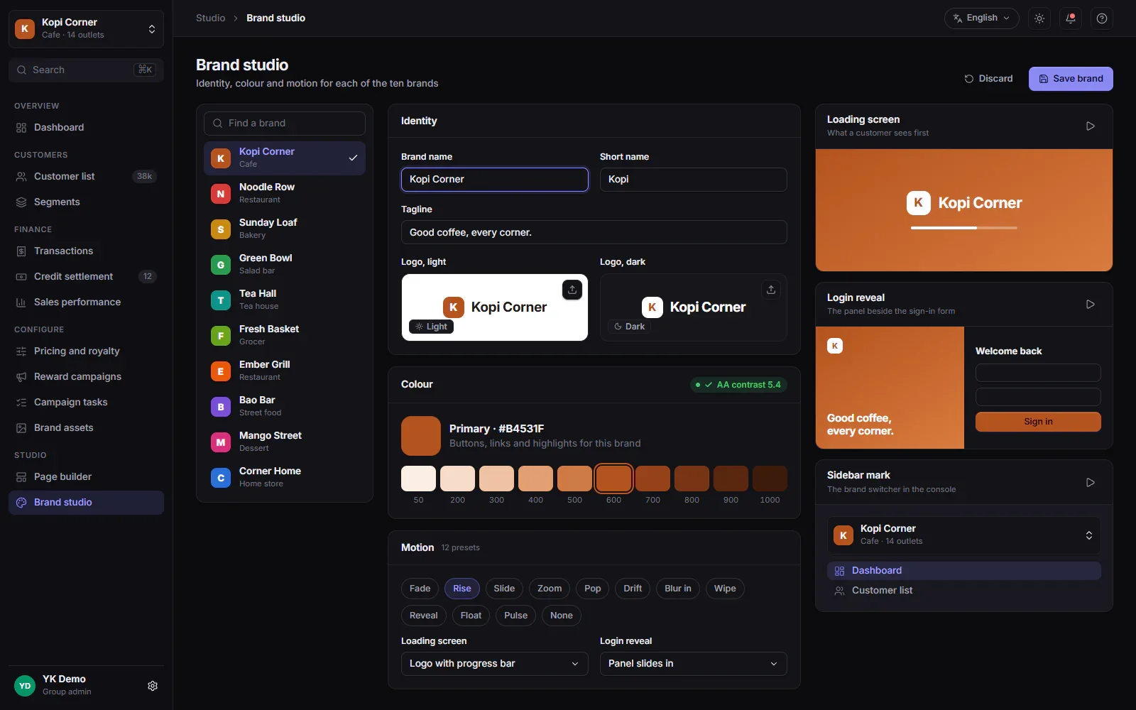
Brand studio in light mode: a brand list, identity and colour settings and three live previews Brand studio in dark mode: the same settings and live previews

Brand studio

Each brand sets its logo, colours and motion, with live previews of the loading screen, sign-in and sidebar.

By the numbers

3 weeks

About 3 weeks, against a plan of about 8 months.

  • ~100 pages on the new design system
  • 71 component folders in the shared library
  • 82 patterns in the component registry
  • 10 + 12 colour brands and motion presets
  • 384 old files retired in one commit
  • 4 languages: English, Malay, Simplified and Traditional Chinese

Names, brands and data on this page are made up. Every screen was rebuilt for this page in a neutral retail and food setting. The old look uses a public open-source template. These are pictures, not a live product.

Have a tool that looks like the before?

Tell us what it should do, and we will say what it would take.

Tell us your chore on WhatsApp